Trendy colour palettes for different business types
Colours let you change the look of your design by enhancing and clearly defining the meaning it needs to portray. Playing with the right hues in the colour palette can make a website look aesthetically appealing and intensify the impact of the products it display. Here is a collection of some of the trending colour combinations.
Colours are an essential element to convey what a website or design needs to say and also defines the personality of a brand. Choosing the right colours is essential to a website’s success. While for years, websites and designs fell into either black and white or colourful schemes, the digital and colour preferences of people have evolved with time. Here are 5 different colour palettes to create unique colour combinations.
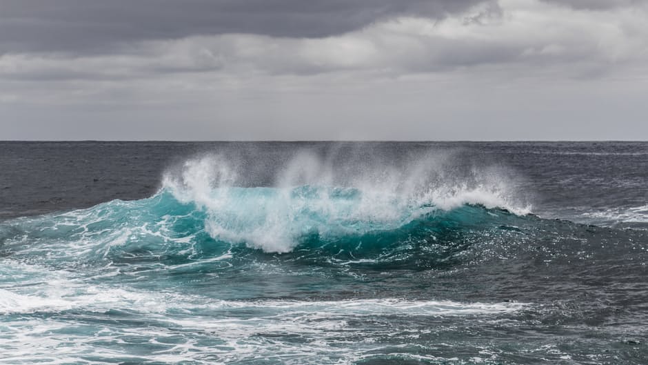
Green is the new blue
Gone are the days when you think of just blue while designing something that is concerned with water. Sea green, bottle green and peacock green mixed with glass blues are the new tones for representing water bodies. However, these colours also make great combinations when applied with contrasting hues like yellow and red.

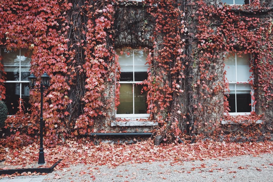
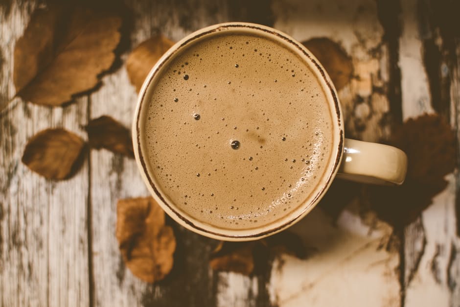
The autumn feel
Burgundy, green, pink, grey and cream! Do we need to say more? This combination is a delight for the eyes can make a perfect partner for many types of websites especially the ones falling under wedding and jewelleries or fashion blogs.
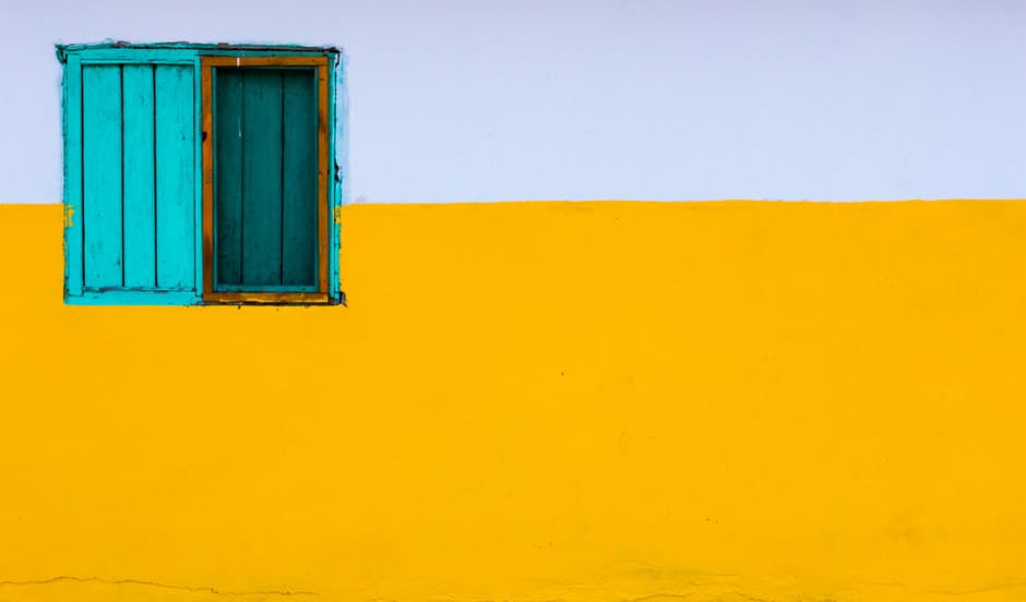
What’s your choice: antique or marigold?
Monochrome combinations with different shades and hues of the same colour like black, grey, brown and yellow with different amounts of brightness, gives it an antique look. The combination of brown shades is best used to symbolise an organic brand. However, Yellow and marigold shades are also considered traditional and happy colours which look antique at the same time.

Rust
Pastel shades of brown, charcoal and blue give a rustic effect to a design, which gives it a sophisticated look.


Go the Greek way
Bright and vivid shades of primary colours like red, yellow, orange, blue and green create an everlasting impact on the viewers. This includes combining the shades opposite on the colour palette which makes the design look different yet appealing!