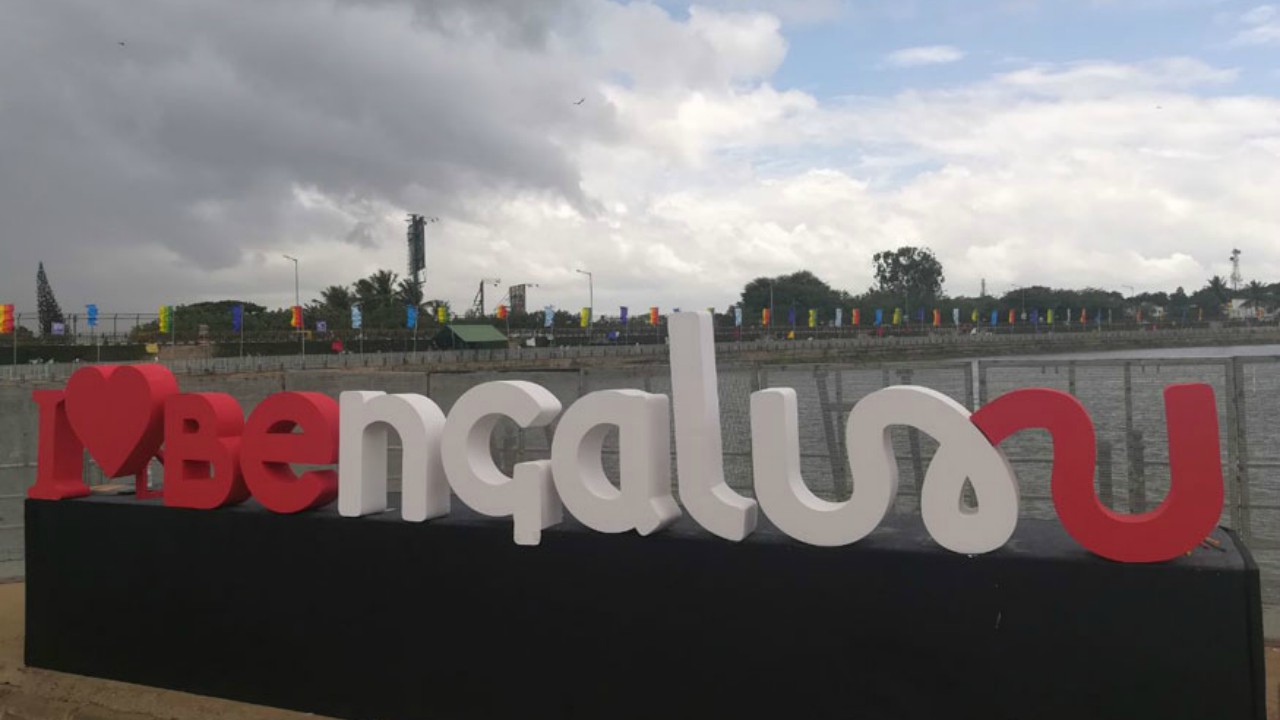
Bengaluru, capital city of the south Indian state of Karnataka, has become the first Indian city to have its logo. A reflection of culture and heritage, the logo is intended to promote tourism in the city, which is often traversed only for professional reasons.
Having a typography both in English and Kannada, the logo ‘Be U’ is said to be having a universal appeal, and a uniqueness to it. The logo’s first part is in English, while the rest in Kannada, the regional language.
The logo comes after a controversy over the state having an exclusive flag. Bengaluru is now in the league of global cities such as New York City, Melbourne, Singapore, which have their own tourism logo.
The logo has been designed in three colours – green, red and yellow, to be used variedly for different purposes or events. It has been designed by Nammur, a design start-up, which won a contest and received an amount of half a million as prize money from the government.
The government wishes for people to identify Bengaluru with the logo, for which there are also plans to convert it into memorabilia. Presently, the memos that most people take back from Karnataka are silk from Mysuru or toys from Chanapatanna, both items with a direct link to Bengaluru. The new logo is thus being looked forward to being on items such as T-shirts, mugs, fridge magnets, an attempt that shall also generate new jobs.
Explaining the idea behind Bengaluru to get a logo, Priyank Kharge, Karnataka Tourism Minister said, “Like in ‘I love New York’, New York is written in a particular way. Also, London, Amsterdam, Lyon, Melbourne… How do I identify Bengaluru outside the city? Now, we have the perfect identity that captures the spirit of the city and its people.”
“What’s more, the design comes from the very people of the city,” he added.
The government is hoping to improve the identity of the city by creating a brand value that could attract more tourists and stimulate the hospitality and tourism industry in Bengaluru.
Bengaluru presently attracts working professionals in large numbers, who move to the city predominantly for jobs in the IT sector. The pull for tourists is less. We wanted to remedy this and portray the rich history and culture of the city,” the minister said.
The city’s cultural side has also been tried and incorporated into the logo. “It is for this reason that some of the English letters have been designed to look similar to characters in the Kannada script,” Nammur’s Vinod Kumar said. The logo was also designed to subconsciously teach Kannada, he said.
The logo thus fulfils the state government’s idea of sharing its culture with its many national and international visitors, who would often just pass through the city, not taking back a piece of it.
“The idea of the logo is to integrate all experiences of Bengaluru online along with seamless offline solutions to ensure we are India’s first tourist-centric city and gateway to South India,” said Kharge.